 For example, my magazine’s logo has been kept simple but eye-catching, such as those of NME and Q.
  Most of the copies of NME that I looked at did not feature a positioning statement, so I could not take ideas from it and whereabouts it is placed on the magazine.
In terms of the main image on my magazine, I wanted the photograph to be taken from around the waist upwards, so that you can see what the person in the photo is wearing. My main inspiration and ideas for the front cover image came from NME magazine, as they often feature photographs from this camera angle (mid shot).

The style of clothes my model is using are very similar to that used on Lily Allen in the NME example because I think that checked shirts are representative of the indie/alternative genre. My photograph has a brick wall background even though most of the magazines I analysed had a plain one-colour background, because I think that it makes it look more interesting and also adds to the image of the genre. Also, if I had a plain background I would have had to have more coverlines and my photograph would have had to have been a larger, closer up image of my model. I also used a circular sticker on my magazine similar to the ones used on the cover of NME.


My main coverline was coloured text with an outline to make it stand out, similar to the NME “Reading & Leeds” coverline featured above. It also included a small line about what the main story is about in text that is a different colour from that of the main coverline but the same colour as the other coverlines on the magazine, but with an outline to make it stand out.

Above is a diagram that shows how my contents page is mostly similar to that of the Q magazine. This is because I think the Q magazine has a good, clear contents page and I tried to base my contents page on it as much as possible without copying it completely. The one thing that is different about my contents is that it has a subscription information box at the bottom as well as a miniature picture of the front cover

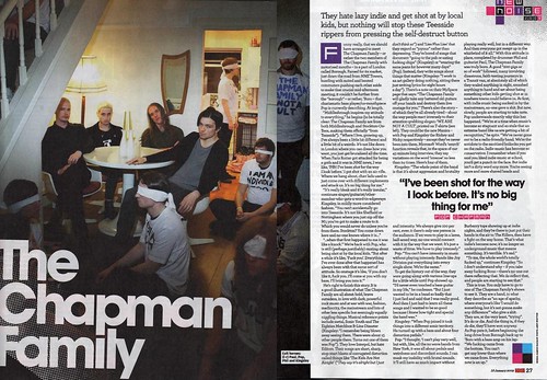
My double page spread is not really like any of the double page spreads I have seen in the magazines I have analysed, such as the example from NME magazine above. Instead of having a full side for an image, my image is in the top middle. It was originally half a side but it was not balanced so I moved it into the middle. Because of the position of my image, I had to remove the drop quote that I originally had as it would not fit anywhere without looking too busy and cramped. However the rest of the features of my double page spread match that of the ones I analysed, such as having a standfirst before the article, an enlarged letter at the start of the article and a by line. It also has a large title which is relevant to the article and that is referenced in the article itself, and goes right across the top of the page. My double page spread also has appropriate page numbers and name of the magazine in the bottom corners. The font is size eleven, which is the conventional font size as it is not too big or too small. However the standfirst is larger than the article text because it is an introduction and therefore is supposed to be bigger.
2. How does your media product represent particular social groups?
My magazine represents particular social groups because my magazine is aimed at people who dress in a similar way to the way the model on my front cover is dressed i.e. a checked shirt or a t-shirt with a slogan on it. It represents people who are into the type of music and bands that I have included in my magazine and I think that these people would wear the clothing I have previously mentioned. 

These pictures are what came up when I searched “indie” in Google, as this is the type of music my magazine features. I think these images sum up what the type of person who would buy my magazine looks like as they would wear the clothes featured in the second picture and perhaps look like the people in the first picture.
3. What kind of media institution might distribute your magazine?

This is a collage I made of some of IPC Media’s other magazine brands, with the music focussed ones shown at the front.
This is a collage I made of some of Bauer Media’s other music magazines, with the magazine most like the one I created at the front.

4. Who would be the audience for your media product?
This video (http://www.youtube.com/watch?v=EeOwnVm6X1U between 2:16 and 2:40) shows fans of the band Keane, who I featured in my double page spread article. I think they are representative of the type of people who would read my magazine. I also asked some people who I thought would fit into the target audience of my magazine and filled out profiles about them. I think that these profiles show the kind of person who would buy my magazine and what kind of things they like to do, etc.
Name: Emily
Age: 17
Occupation: Student
Hobbies: Photography, listening to music, hanging out with friends, social networking, reading
Likes: Painting, drawing, photography, shopping with friends, music.
Favourite music: The Script, The Killers, Maroon 5, Coldplay
Name: Faye
Age: 14
Occupation: Student
Hobbies: Sleeping, reading, social networking, going to the cinema
Likes: Movies, books, music, the internet, friends, shopping
Favourite music: Coldplay, The Killers, Lady Gaga
5. How did you attract/address your audience?
To attract the target audience of my magazine, I tried to include many of the things that they typically like and use colours and styles that I know they like. This was helped by my research and the questionnaires which I handed out to mostly people who I thought would be into the type of music that I was including in my magazine. I tried to include features on bands that the questionnaire respondents said they liked and use colours that connote the genre of music that my magazine was about. Another thing I did to try and attract my intended audience was to make sure the model on the front cover was wearing clothes typical of the type of person I wanted to read my magazine, and this meant that I picked agirl who was wearing a checked shirt with a t-shirt underneath as this is the kind of clothing that my audience is likely to wear.
I asked two members of my target audience if they would buy my magazine and what wouldmake them buy it and recorded their answers.
6. What have you learnt about technologies from the process of constructing this product?
In terms of media technologies, I used photography and video recording equipment in the research part of the task, and photography again in the production part of the task. The video recording was used to record people answering questions for my questionnaire. Also in the main production part, I used different software to create my products such as Quark Xpress for the contents page and double page spread, and Adobe Photoshop for photo editing and creating the front cover.

As shown in the image above, I used Quark Xpress to create my contents page and double page spread. The image shows the first version of my contents page. I had never used this program before and so I had to learn how to use it when I first started the preliminary task, as a practice for my actual piece. Obviously when it came to creating my real coursework piece, I was much better at using Quark and found it quite easy to use.

Shown in the above image is a screenshot of me using Quark Xpress to create my double page spread. The image shows the first version of my double page spread. I hadn’t made a double page spread for the preliminary task so I had not yet used Quark to create anything like that. I used the column feature to its full potential to align my text in equal spaced and sized columns.

I used Adobe Photoshop to create my front cover. The image shows the second version of my front cover. I already knew how to use Photoshop before I started this task so I did not have to learn very much. Although I did learn more about how to do different things using Photoshop, such as how to put effects onto text (see below image showing how I created my title/main coverline)

This image shows how I used the “layer styles” menu on Photoshop to make my title have a coloured bold outline. I used the “drop shadow” feature and set the opacity to 100% so it wasn’t faded at all, and then made the size of the outline 27px so it would stand out.

The above image shows how used the “layer styles” menu again to create an outline for my main coverline. This time I used the “outer glow” feature and set the size to 24px and the opacity to 100% again. This makes it stand out from my other coverlines.

This image shows how I created the glowing effect on the star shape in the top right hand corner of my magazine. I used the “layer styles” menu again on “outer glow” but this time the opacity was set to 75% because I wanted it to look faded and as if it was glowing, and the size was 79px as I wanted it to stand out.
7. Looking back at your preliminary task, what do you feel you have learnt in the progression from it to the full product?
Pre-production magazine: 

Production  magazine:


No comments:
Post a Comment